Casebook
In-App Microcopy
Background: At Casebook, we created a mobile app for social workers. This app streamlined their work, allowing them to fill out forms on the go while picking up children or inspecting daycare centers. In-app notifications were crucial to the app, telling social workers when a location needs an inspection or when they need to go get a child.
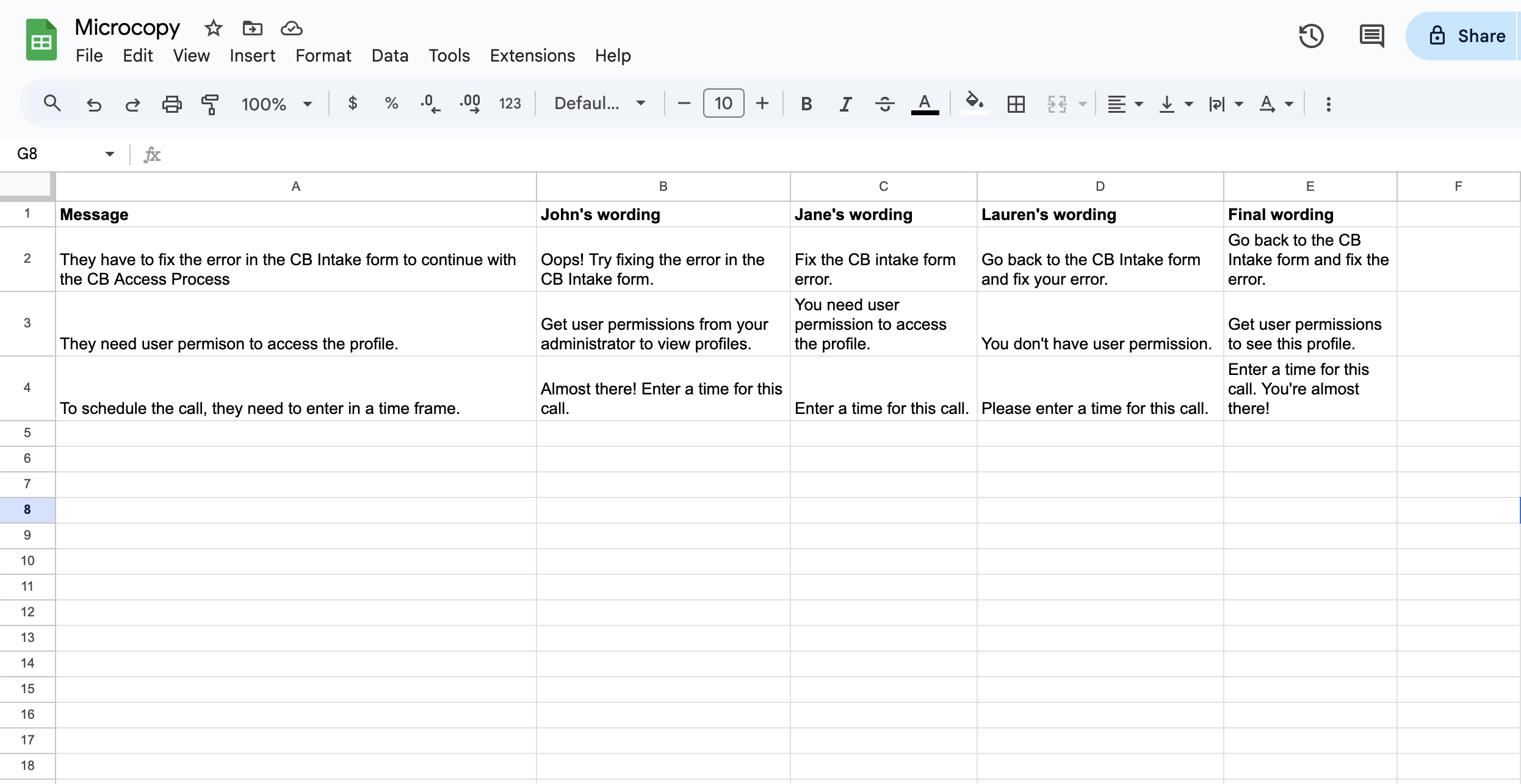
Collaboration: A product manager, UX designer, and I chose to jointly write in-app notifications. We recognized that we all had good ideas for wording. It often worked best when we combined our ideas. To do this, we wrote our ideas for the microcopy into a spreadsheet. We were able to combine the best wording from each contributor to create the best possible sentence.
User Research: We included some cheerful language based on direct customer feedback. Social workers explained that their jobs are intense and a small, “You’ve got this!” or “Great job!” could keep them motivated throughout the day.
The Outcome: As a result of this project, social workers were able to do their work more effectively.
Collaboration spreadsheet: Here’s what our collaborations looked like.
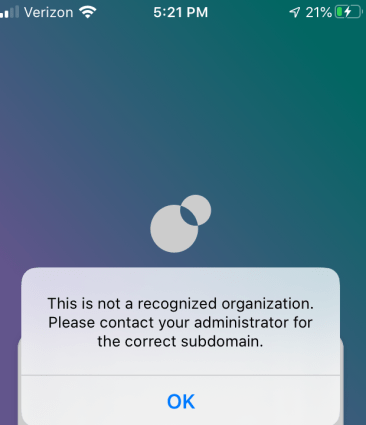
App Screenshot: Here is one notification I wrote for when a user fails to log in. This was an important logistical notification. I tried to make it clear what the employee needs to do while still using the most accurate words for that situation:
Knowledge Base Menus
Background: At Casebook, I single-handedly created a large public knowledge base complete with both articles and video tutorials to help customers fully understand the product and its features. Part of this project was designing the menus, which involved figuring out the menus’ information architecture and how to title articles.
Information Architecture Design: The Casebook product was divided into several modules, including cb Access, cb Engage, and cb Intake. I therefore decided to have one menu section per module as well as a more general, “Getting Started” menu section. I also tried to title the articles in a way that clearly defined what each article taught the user.
User Research: I did user testing on two different versions of the menu design, one on a single page and one with a side-panel. Users strongly preferred the side-panel design because it didn’t require them to keep clicking the back button. That helped me choose which WordPress plug-in to use to create the menus.

Users found the above^ menu easier to navigate than the menu style that you see down below.

The Outcome: As a result of this project, we sold the product to many customers, all of whom said the knowledge base was a key selling point.
Additional Content: To see some articles that went into this knowledge base, click here and scroll down the section entitled “Casebook Documentation.” To see a video tutorial that went into the knowledge base, click here.
Mozilla
“Create a New Knowledge Base Article” Tool Tips
Background: Mozilla had many volunteers who wrote help articles. I needed to teach these volunteers how to use Mozilla’s tools to write these help docs. The tool they needed to use was the “Create a New Knowledge Base Article” feature.
User Research: After talking to users, we realized that the headings and the design of the tool was not intuitive. Users did not understand what each heading meant and what to enter into each section.
Resolution: To help users understand how to fill out the “Create a New Knowledge Base Article” form, I added tool tips next to each heading.
The Outcome: As a result of these tool tips, the feature became more intuitive and easier to use. Volunteers could understand how to use it more quickly and therefore write more help articles.
Illustration: Open the PDF below to see my tool tips:
